QUEENAN
QUEENAN
About
Queenan is the rebrand of my personal design practice into a fully resolved studio identity. The brief was simple, stop operating as a freelancer and start presenting as a studio. The kind of studio that ambitious brands, clients and studios take seriously.
The previous identity had no system behind it. No visual language, no philosophy, no consistency across touchpoints. This project changes that entirely.
Concept
The starting point was a question, what do I / we represent?
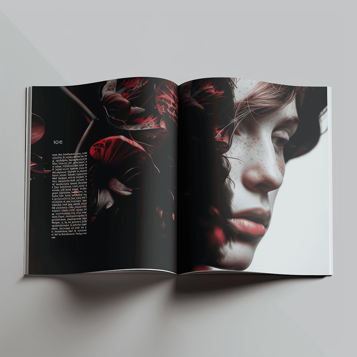
The answer came through a material: glass. Built under pressure, transforms light, refracts into colour. That felt honest. But the deeper I went, the more the glass metaphor gave way to something more fundamental which was energy itself: Motion, sound, light, particles. All are forms of energy in some way whether its kinetic, thermal, chemical etc.
The sphere became an 'energy core'. Its surface is infinite, it can be anything, any material, any world. Its form never changes. That tension between the constant and the variable became the organising principle of the entire system and this is what I tried to replicate with the home page, the photography, the circular themes.
From that came my philosophy, controlled chaos. The grid is Swiss, the type system is resolved, and the colour and sphere disrupts all of it. RGB and CMYK primaries appear across the system: in layouts, gradients, and the sphere itself.
Client
QUEENAN

The chaos is not a moment. It is the operating mode. The rigour makes it readable. The colour makes it alive.

The sphere concept began as glass and evolved into energy. Energy is a force, a material has limits, a force doesn't. The sphere as an energy core has no ceiling on what its surface can become. (and also because the surface is literally infinite).

Before any visual decisions, the positioning had to be resolved. Queenan is an independent motion and brand studio working with premium, aesthetic-led brands. The name stays, but the identity shifts from freelancer to practice.

A complete brand system was built in Figma across 40 slides at 1920×1080px. Colour tokens, typography scale, grid specifications, spacing system, motion principles, voice and tone, and application across static and digital touchpoints. Two typefaces: Satoshi for display and body, IBM Plex Mono for all technical detail copy.

Grid Layouts


The sphere hero on the landing page is not a video or a static render. It is a live, interactive Three.js component with custom GLSL shaders, domain-warped fractional Brownian motion liquid simulation, three orbiting light sources, drag rotation with inertia, click ripples that physically displace the liquid surface upon interaction. It was built in Claude Code and deployed as a Framer code component (.tsx file but also .html compatible). The sphere responds to mouse drags, clicks, and proximity. It is the brand device behaving as a system that moves.
The motion principle operates on an orbital axis, a continuous revolution derived from planetary motion. Every position of the orbit is a different moment of energy. The sphere acts as both a brand and a transitional device, entering first, masking content, revealing scenes. The motion language is not yet fully produced but the system and principles are defined.
Latest projects
QUEENAN
QUEENAN
About
Queenan is the rebrand of my personal design practice into a fully resolved studio identity. The brief was simple, stop operating as a freelancer and start presenting as a studio. The kind of studio that ambitious brands, clients and studios take seriously.
The previous identity had no system behind it. No visual language, no philosophy, no consistency across touchpoints. This project changes that entirely.
Concept
The starting point was a question, what do I / we represent?
The answer came through a material: glass. Built under pressure, transforms light, refracts into colour. That felt honest. But the deeper I went, the more the glass metaphor gave way to something more fundamental which was energy itself: Motion, sound, light, particles. All are forms of energy in some way whether its kinetic, thermal, chemical etc.
The sphere became an 'energy core'. Its surface is infinite, it can be anything, any material, any world. Its form never changes. That tension between the constant and the variable became the organising principle of the entire system and this is what I tried to replicate with the home page, the photography, the circular themes.
From that came my philosophy, controlled chaos. The grid is Swiss, the type system is resolved, and the colour and sphere disrupts all of it. RGB and CMYK primaries appear across the system: in layouts, gradients, and the sphere itself.
Client
QUEENAN
The chaos is not a moment. It is the operating mode. The rigour makes it readable. The colour makes it alive.
The sphere concept began as glass and evolved into energy. Energy is a force, a material has limits, a force doesn't. The sphere as an energy core has no ceiling on what its surface can become. (and also because the surface is literally infinite).
Before any visual decisions, the positioning had to be resolved. Queenan is an independent motion and brand studio working with premium, aesthetic-led brands. The name stays, but the identity shifts from freelancer to practice.
A complete brand system was built in Figma across 40 slides at 1920×1080px. Colour tokens, typography scale, grid specifications, spacing system, motion principles, voice and tone, and application across static and digital touchpoints. Two typefaces: Satoshi for display and body, IBM Plex Mono for all technical detail copy.
Grid Layouts
The sphere hero on the landing page is not a video or a static render. It is a live, interactive Three.js component with custom GLSL shaders, domain-warped fractional Brownian motion liquid simulation, three orbiting light sources, drag rotation with inertia, click ripples that physically displace the liquid surface upon interaction. It was built in Claude Code and deployed as a Framer code component (.tsx file but also .html compatible). The sphere responds to mouse drags, clicks, and proximity. It is the brand device behaving as a system that moves.
The motion principle operates on an orbital axis, a continuous revolution derived from planetary motion. Every position of the orbit is a different moment of energy. The sphere acts as both a brand and a transitional device, entering first, masking content, revealing scenes. The motion language is not yet fully produced but the system and principles are defined.